Critics say traditional tools are inadequate for illustrating risk; one ERM member has found success modernizing them.
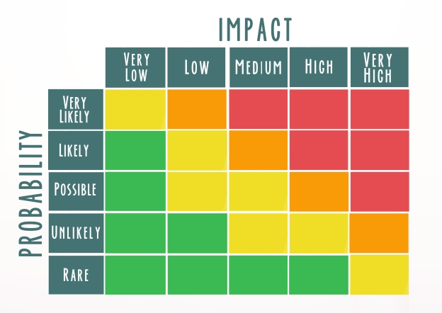
Pity the poor risk heat map. This well-worn tool, traditionally used by ERM teams to provide a visual representation of the range of risks a corporate faces, is now an object of scorn for some risk managers, including NeuGroup members.
- “Heat maps must die,” one member said at a recent NeuGroup meeting for ERM heads, a sentiment echoed by a number of his peers.
- Also on the hit list of ERM tools that critics say are outdated, ineffective or insufficient: risk registers.
A substitute for thinking? “I have a campaign against heat maps,” the member quoted above added. “In our organization, they can tend to be used as a substitute for thinking and give an illusion of precision.”
- He said that heat maps—or risk radars—aim to show exposure to risk as a simple way of visualizing the data found in a risk register; but he believes they are only marginally more useful than a spreadsheet full of numbers.
- Another member echoed the displeasure with the simple tool and said, “The only utility I see in heat maps is a way to appease auditors.”
- The member who has a campaign against heat maps works at a private company, minimizing the need for him to deal with auditors and leaving his team with “basically no reason to ever use [heat maps].”
- When one treasurer became responsible for his company’s ERM program, he inherited a risk register that tracks the company’s exposures to risks but does not process or analyze the data in any way.
- He said it felt like a tool from a previous generation, a tracker that may be “filled with risks, but no one ever does anything with it.”
A smarter risk register. One member suggested that heat maps and risk registers are not useless. His company developed a sophisticated risk register that can generate heat maps. The automated solution tracks the company’s risks and sends notifications for required follow-up actions.
- The member said this tool was borne out of a company-wide desire to create a culture of risk-awareness, like many others who have recently kickstarted programs to eliminate what has become a check-the-box ERM routine.
- The solution employs a user-friendly interface designed with a data visualization software. It’s connected to the raw data for the company’s risks and analyzes those using algorithms.
Tell a story. The member said that other corporates may not necessarily need the full-scale automation used by his company, but recommends they adopt a similar mindset and are thoughtful when employing heat maps.
- Presenting risk exposure to leadership, he said, is about storytelling first. “If all management has seen is one heat map after another, it will be hard for them to engage with the material,” he said. “The key to getting heat maps right is to present them alongside clear conclusions—in other words, explain why the heat maps matter.
- “With any heat map, you should be able to study for 30 seconds and know the story. If it takes any longer, it’s bad.”
- The member said there can be a tendency for functional teams to look at data and try to come up with as many ways as possible to present it. “That’s an incorrect process. The right process is finding the significance of data before presenting and developing meaningful, actionable metrics. When it comes to metrics, more is not always better—in fact, it can be worse.”